

Agricultural Data Displays
Making agricultural data easy for small, independent farmers to consume, and enabling the creation of a mobile app.
Create a system of data displays that emphasize the most important information for easy at-a-glance consumption
Ensure similarity across displays, creating a unifying design system that is consistent and alleviates cognitive load
Make data displays more friendly to responsive layouts, especially for mobile and tablet sizes
My Tasks
9 different categories of cards with different kinds of qualitative and quantitative data, all needing new visual treatment
Many, many edge cases per card
Scalability of data displays — especially with inflation
Multiple cards had concurrent overlapping projects with requirements that needed to be incorporated
Challenges and Restrictions
Outcomes
app downloads from the Google Play store
1k+
updated categories of data display
9
01
Company Background
What is CHS?
CHS is a corporatized cooperative that enables small farmers and local cooperatives to manage products, services, and supply chain connections. CHS also provides data insights for small farms to grow sustainably and remain competitive.
MyCHS is a retail platform provided to individual farmers within CHS to track their purchasing, sales, futures, and other financial transactions with the cooperative.
I received this project during a period of rapid growth for CHS, with strategic priorities including the scalability of the visual interface and improving the visual communication and polish of the site.
02
The Project

The displayed invoices cards (censored of identifying information) are an example of the pre-redesign data displays.
What kind of information needs to be displayed?
On MyCHS, farmers manage data regarding nine different categories of transactions with CHS:
Crop contracts
Capital loans
Commodity invoices
Payments
Commodity bookings
Prepayments
Settlements
Advances
Shipments
There are many transactions for farmers to sift through in each category, making it critical that the most important information be front and center and easily digestible. Further information could be accessed through detail pages linked to each card.
The Legacy Displays
MyCHS’s legacy cards displayed all pieces of data with equal emphasis, making it difficult to pick out the most important information from one transaction, let alone parsing through hundreds. These displays also did not rely on any kind of iconography for easy browsing, and used an outdated visual scheme.
03
Approach
Familiarity and Distinctiveness
Most farmers would be seeing all nine different types of transaction cards. This meant that there needed to be enough consistency in card layouts that a visual language was created that could be easily understood. However, there also needed to be enough distinctiveness in the layout of each card that farmers could easily tell what kind of transaction they were looking at without unnecessary cognitive load.
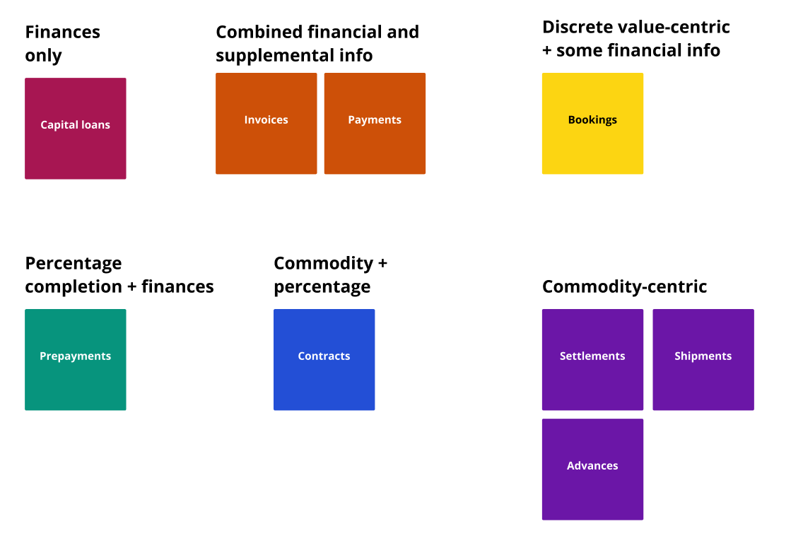
Transaction data types
In the cardsort above, you can see that each transaction type could be categorized by the type of data it showed, or what combinations of data it displayed — this would be the key to maintaining consistency across card to create a visual design language, while also keeping transaction types distinctive.
My cardsort of transaction types, by the type of data they displayed and in what combinations
04
Research and Discovery
Working with Business Analysts
Due to the agricultural seasonal cycle, it was very difficult to hold direct conversations with a sizeable sample of farmers during the ideation phase. However, the CHS business analysists I worked with were deeply knowledgeable about the priority of information for each transaction, especially since many CHS employees are farming members themselves, and through their prior collected customer feedback.
I was able to use CHS business analysts as a secondary resource to understand the priority of information for each transaction type.
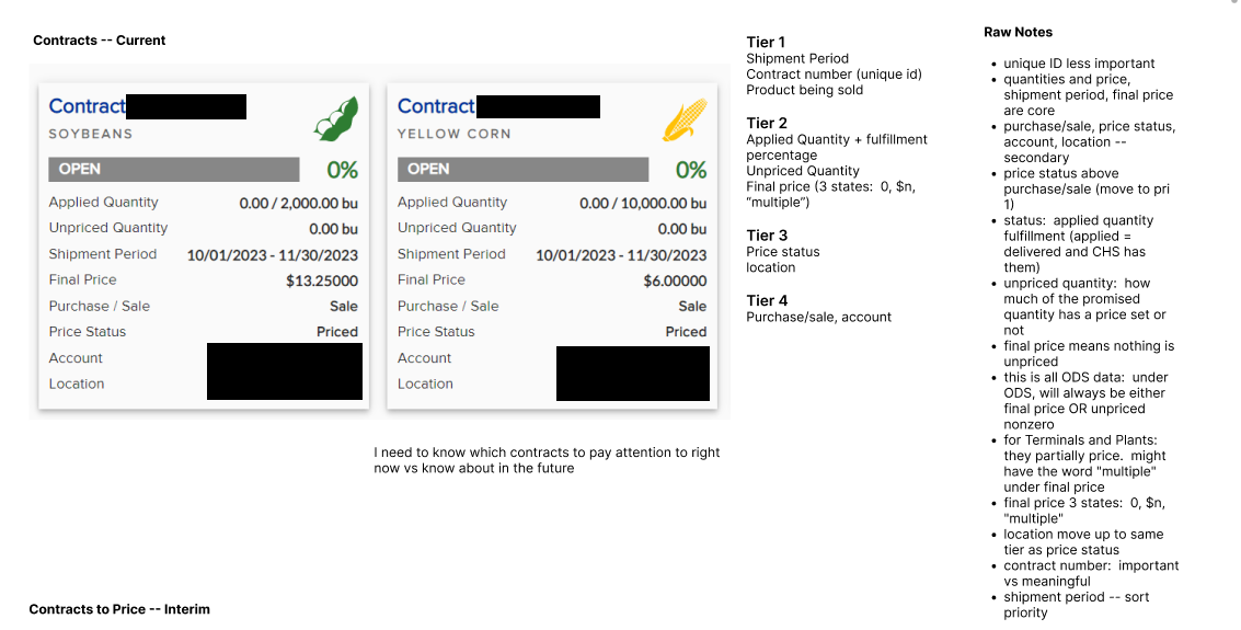
The original contract card, censored, with my notes on data prioritization.
Data Prioritization
In order to emphasize the correct information per card, I needed to understand what the most critical info displayed was. This was a key discussion with business analysts, and I focused a large portion of the discovery phase on understanding what information was most important in each transaction’s context, and what data contextualized each other.
States and Edge Cases
Every transaction card would need to be scalable to many different combinations of information — for example, shipments cards would need to show different fields depending on the type of crop being shipped, the transportation method, and other shipment variables. Additionally, each card would have states such as open, closed, fulfilled, partially fulfilled, etc.
To ensure that I could cover all states and edge cases, the business analysts and I collaborated to track every variable combination and all possible states.
05
Ideation
Modular design
Based on my cardsort during the discovery phase, I identified the following modules that could be filled with data and combined to tell each card’s transaction story:
Financial figures (main and contextualizing)
Percentage fulfillment/completion of some metric
Commodity/crop details
Discrete values (main and contextualizing)
Qualitative supplemental details
The following modules would also be shared across all cards:
Transaction identifier
State identifier
Account identifier, where applicable (if the farmer had multiple sub-accounts)
I began experimenting on multiple different transaction types in parallel, to try out different layouts for each module and see what would scale to all applicable transaction cards.
Communicating States
In addition to needing displaying and combining different modules of data types, most of the transactions also had a sense of active/inactive along multiple dimensions:
open/closed (and in some cases, an in-between state called “fulfilled”)
unpaid/paid
not due/overdue
incomplete/complete
I set to work determining the most scalable options to communicate these states, weighing the need for consistency and simplicity against distinguishing between different ways a transaction card could be in its “inactive” state.
Streamlining Information
A number of cards had pieces of information that contextualized each other, or otherwise could be streamlined or made more concise. I spent a lot of time working with the business analysts to understand which combinations of data could be contextualized: for example, a contract card has been priced will have a zero “unpriced” amount.
Design Partnership
Due to the high number of cards, I collaborated towards the end of the design phase with another designer who had some bandwidth — she ended up taking over the design of two cards: Prepayments and Settlements.
06
Overlapping Projects
Capital Loans Portal
At the same time as this data display refresh, I was also redesigning the capital loans portal, which meant that the data displays needed to scale to the context of loan cycles, as well as the redesigned detail pages:
Shipment Data Verification Pending
I was also working on a project to support the real-time display of scale ticket data for crop deliveries — this meant that sometimes, data would be displayed on shipment cards before it could be fully verified in the database. To reflect this, there needed to be room on the cards for a display of this status, and there was not in the previous design.
Before I completed the full shipment card redesign, I incrementally handed off an MVP version of the card that could support the verification-pending status marker in the interim, as well as the real-time scale ticket notification.
The interim scale ticket design that supported the pending unverified data, as well as the detail page and scale ticket notification.
Sitewide Increased Responsiveness
At the same time, I worked on several projects that involved making MyCHS features more responsive to more screen sizes — this was particularly important for our user group, since farmers often took phones and tablets out into their fields and needed mobile displays. These card displays were an important step in the process of moving towards a mobile app, and were transforming the site alongside a redesigned navigation and more easily navigable settings.

Redesigned Navigation
Desktop old vs redesigned views of the navigation menu.
The new mobile-friendly menu responsiveness.

Account Preferences
I re-organized the account preferences and renamed them “settings” to group email and paperless settings into “communication preferences,” as well as providing a more intuitive structure to the settings page.
I created a mobile-friendly version of navigation between settings groups.
07
User Feedback
An affinity diagram I created to analyze session feedback.
Impromptu Interviewing
The opportunity came up for some rounds of user testing for another project, and so the lead designer and I took turns facilitating. During some of the sessions, the participants brought up frustrations with understanding transaction data, particularly in large quantities, tangentially related to the goal of the sessions. Where time allowed, we used the opportunity to demonstrate the new transaction card designs, which were met with great approval.
08
Handoff
Assets
Due to issues in our team’s seats of Figma Dev Mode, I redlined all stylistic components of the handed-off data displays, in addition to the labels and rule documentation. Full rule documentation was done in collaboration with the business analysts.
Hi-Fidelity Mockups and Specs
Below are the 7 out of the 9 transaction cards that I was responsible for creating (the other 2 were created by the designer I collaborated with, using the same modules as below. You will notice consistency in layouts of percentage fulfillment, commodity details, financial details, qualitative details, account info, states, etc.
Crop Contracts


Capital Loans

Commodity Invoices
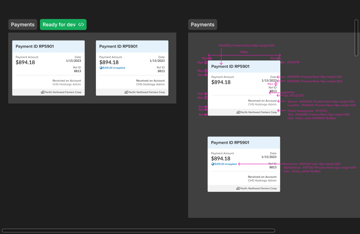
Payments

Commodity Bookings
Advances
Shipments
09
The Outcome
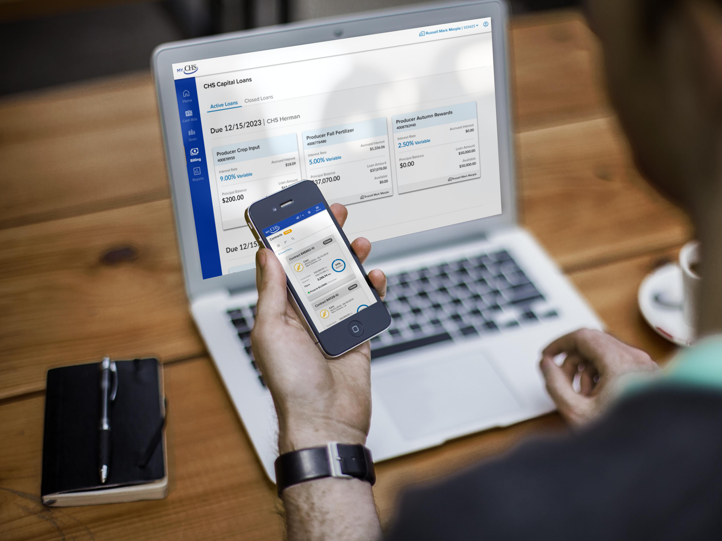
As previously noted, the 9 redesigned cards were part of an overall effort to improve the responsiveness of MyCHS and ability to easily read transaction data on smaller screens, as well as pave the way to the eventual creation of an app, which has proven invaluable to over 1k farmers who need portability of their data.

10
User Testimonials
“My god, look at the difference...it’s like night and day”
“This will make such a difference. It’s so much clearer!”
“This transforms the displays so much.”