Medical Context Tagging
A mission to improve surgical feedback, and my role in driving changes in project strategy through research and data-driven design.
Gain user feedback to validate or change prototype that I inherited
Convince leadership to pivot project strategy based on my research
Collaborate with engineering to design a new case context tagging system, a case metadata extraction process, and directed communication for this feature
Monitor data and recommend design updates
My Tasks
Small startup with limited engineering resources
Outdated platform architecture and visual scheme that had been implemented long before any UX presence at the company
Specific asks by key opinion leaders with our contracted hospital systems
Challenges and Restrictions
⚠️Warning! The following process documentation includes images taken from surgical videos, including organs, blood, and medical instruments.
Original Goal
50%
of incoming cases tagged 3 months after goes live
Actual Results
66%
of incoming cases tagged 1 month after went live

01
Company Background
What is C-SATS?
C-SATS is a company within Johnson & Johnson that provides scalable feedback and objective scoring for surgeons performing minimally-invasive surgery, a field rife with scheduling, resource, and privacy issues.
C-SATS is the first company to make objective scoring and expert qualitative feedback scalable by leveraging a HIPAA-compliant online platform and validated crowd-scoring.
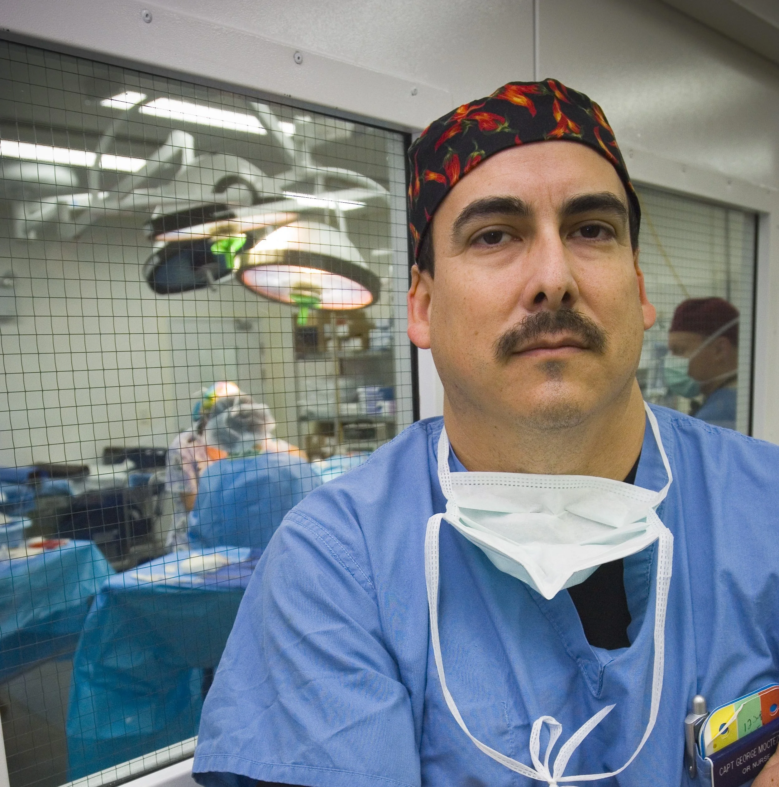
I joined C-SATS at the end of its third year as a small startup, and received this project right before the testing phase.
02
The Project

This is a screen from the original prototype, which was created before I was hired and given to me to test.
What is Case Context?
Case Context is medical information about the patient or procedure that is significant to the performance and outcome of the case. For example, a reviewer might suggest that a surgeon use colored sutures instead of clear, since they are easier to see. However, the patient is allergic to the dye in colored sutures. This context would change the reviewer’s recommendations.
Other Uses
Standardized case context entry could be also used to moderate technical scores based on the difficulty of the procedure, if leveraged in a sophisticated ML model. Gathering this data would early would enable this capability later on.
03
Prior Data and Approach
Clinical Scenario
There was already a free text entry box for context entry (then-referred to as “clinical scenario”) on the in-OR recording device called the C-CAP. However, free-typing on a vertical touchscreen was difficult, especially during a surgery.
The Original Approach
Free text could also be added from the surgeon’s account after case upload, or by an admin within C-SATS. However, since more users entered feedback on he C-CAP, the prototype given to me to test focused on improving that interface.

Clinical scenario entry was overall low; however, the highest percentage entered came from the C-CAP.
04
Hypotheses


Surgeon wants to quickly add case context from the OR without becoming distracted from the patient, instructing the nurse to enter info.

Hypothesis 1
Nurse wants to be able to add case context easily based on surgeon’s instructions during a case, within the Operating Room, without distractions from the patient and procedure.
Hypothesis 2
Expert Reviewer wants clear and rich information about the case they are reviewing, to better inform their feedback to the performing surgeon.
Hypothesis 3
05
Usability Testing
Scrappy Testing
As C-SATS was a startup at the time, shortcuts had been taken in the process, leading to the usability testing sessions doubling as user research sessions, with many initial assumptions prior to my hiring being challenged. Surgeons, nurses, and expert reviewers all participated in the usability testing sessions.

Analysis
I analyzed the research using an affinity diagram to identify trends in the feedback received. Through the sticky notes on my window in the image, you’re looking at The Ave, just off the UW-Seattle campus.
06
Findings
Surgeon wants to quickly add case context from the OR without becoming distracted from the patient, instructing the nurse to enter info.
Surgeon often does not know full context before surgery is underway, and has no time or focus to tell nurse to enter it. Would much prefer entering info themself, after case.

Finding 1
Nurse wants to be able to add case context easily based on surgeon’s instructions during a case, within the Operating Room, without distractions from the patient and procedure.
Nurse often does not know more than generic details before surgeon tells them, and has to be ready at any point to assist surgeon -- no time to enter info during case.
Finding 2
Expert Reviewer does want more detailed and clear information to better inform their feedback for the performing surgeon!

Finding 3
Physical Context: The Operating Room
A possible minimally-invasive operating room setup, from here.
In robotic surgery, just about everyone in the room is facing away from each other. The C-CAP, the in-OR recording device, could be anywhere within this room as well.
Not only does no one have the time or mental space to enter case context while the case is being performed, but the C-CAP could be out of the line of sight of everyone involved.
07
Revisiting Assumptions
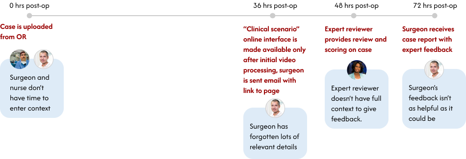
The Conundrum
The time, place, and people for case context entry had been chosen because the most free text was entered through the C-CAP. Although low entry via C-CAP, entry via the app was even lower.
So why did the usability test so strongly indicate otherwise? I revisited the original assumptions, and my investigation revealed three major issues:
Issue 1
The process of receiving access to the clinical scenario entry point in the app took too long.
The page containing the feature was too hard to find, to the point where the surgeons asking for it didn’t know it already existed in the app.
Issue 2
The email containing the link to each case’s clinical scenario entry point buried the link and instructions, and positioned them as an afterthought.
Issue 3
08
Issue 1: Takes Too Long
The Cause: Dependent Processes
The creation of each case’s clinical scenario entry interface was tied to the video processing, which took at least 36 hours, at which point surgeons would forget some details of the case.
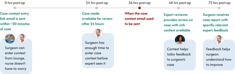
My Solution: Decouple the Processes
I worked with the head engineer to create a process that decoupled case context from media processing, so that the email and link could be generated based on the case metadata, which is immediately available after upload.
07
Issue 2: Hard to Find
The Cause: Poor Navigation and Structure
There was no clear navigation to the case context interface from the main header bar. In fact, participants in the usability study didn’t even know this page and capability existed in the app already, and asked for it to be created.
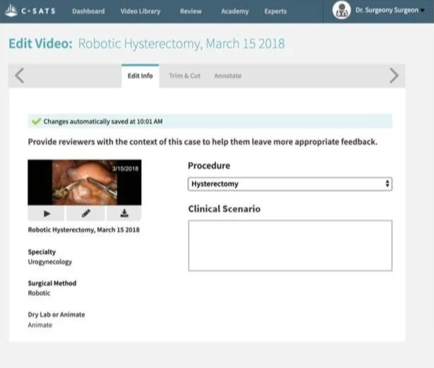
The “Clinical Scenario” box didn’t come with any hint text or instruction about what kind of information may be appropriate to enter.
My Solution: Move Interface (Eventually) and Provide Clear Structure
Moving case context to a more findable page would have involved a more drastic site restructuring, which the startup did not have the time or resources for. I recommended that this interface be moved to the case report page itself, but it could remain here for now as long as the email communication directing users to this page was fixed.
Clear labelling of the new case context interface was needed for users to understand what they were looking at. In order to have a tag system that was not dependent on any other tag or category which could later be rendered obsolete, the data model was structured completely flat, with all non self-evident tags needed to contain their category names.
08
The Cause: Buried CTA and Instructions
The majority of the email and the subject line were a generic confirmation message. No wonder none of the usability test participants knew about the case context entry feature.
Issue 3: Unclear Messaging
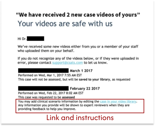
40% email open rate
5% click-through rate
1.3% edit rate
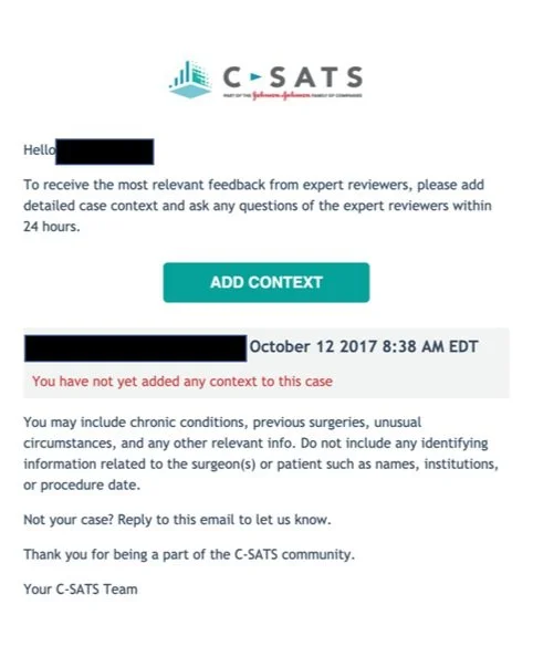
My Solution: Clear And Concise Instructions + CTA
I rewrote the entire email to be about case context entry, starting with instructions on how and why to enter case context front-and-center. Unlike the previous text link, I instead used a primary button as the call-to-action. Lastly, I was sure to include instructions on what kinds of information to include, and what NOT to include.
09
Compromise
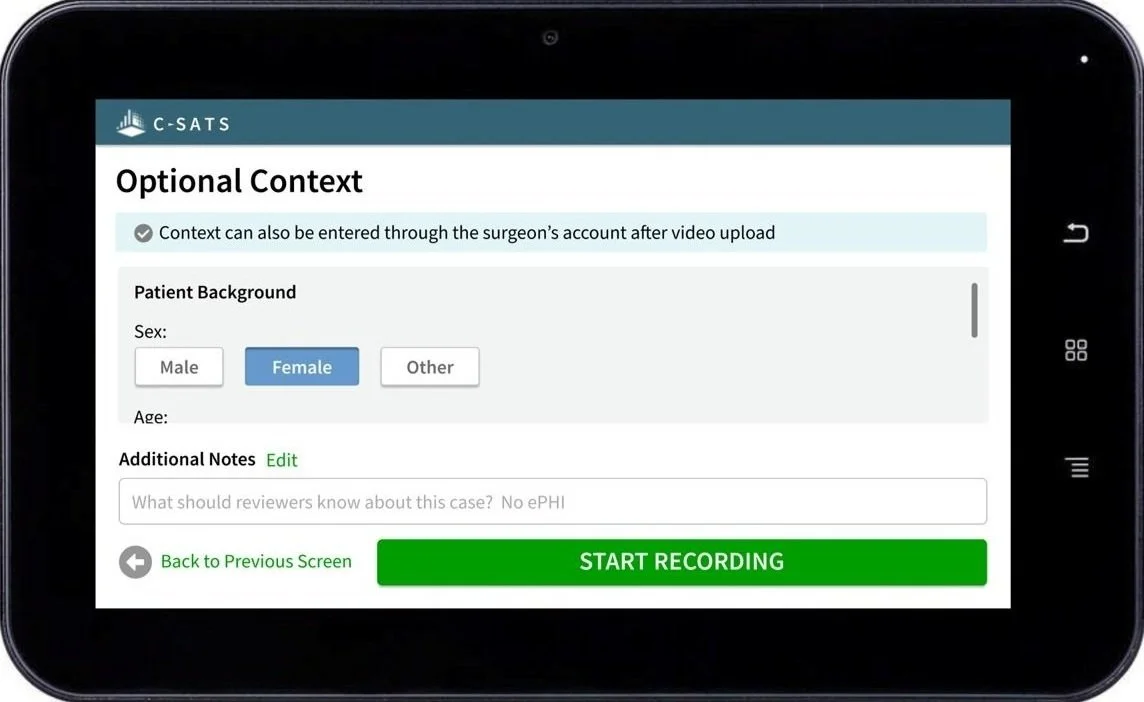
Case Context Interface on C-CAP
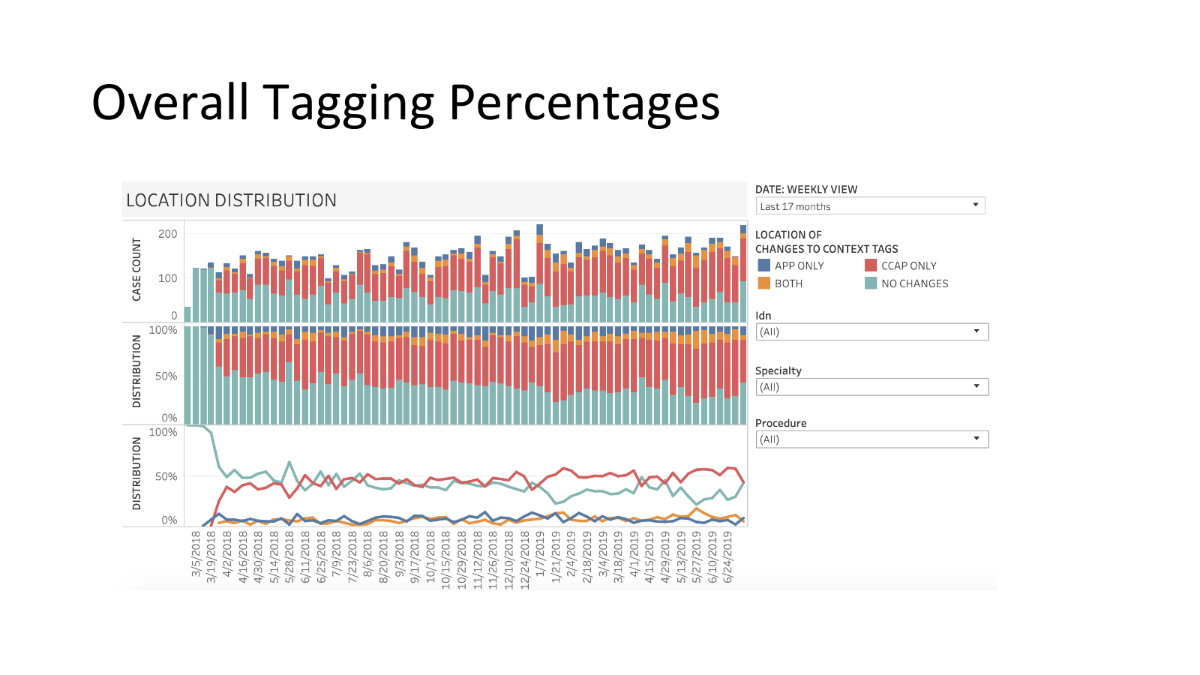
Based on the usability test findings, I strongly recommended making the case context interface available only on the app, both because it was most relevant there, and to reduce friction in uploading cases from the C-CAP.
Some team members were concerned from a business standpoint about removing the case context interface from the C-CAP entirely, since it had been extremely strongly requested by highly influential Champions at key hospital systems as critical to contract renewal. Hence, the first release included tags both on the C-CAP and on the app.
10
Data Monitoring
Adding Scrollbar to C-CAP
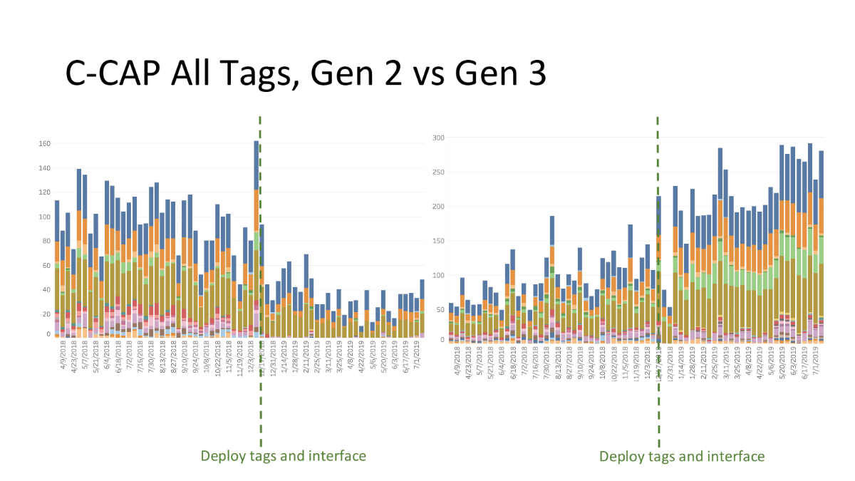
The "deploy tags and interface" line is where enough tags were added to the set to require a scrollbar on the C-CAP devices.
Discovery of Tagging Dropoff
This data led me to discover the cause for an abrupt dropoff of several case context tags being selected within the operating room -- Gen 2 C-CAPs did not show a visible scrollbar at rest, while Gen 3 C-CAPS did. This meant that unless the OR staff was actively touching a Gen 2 tablet only a few tags appeared.
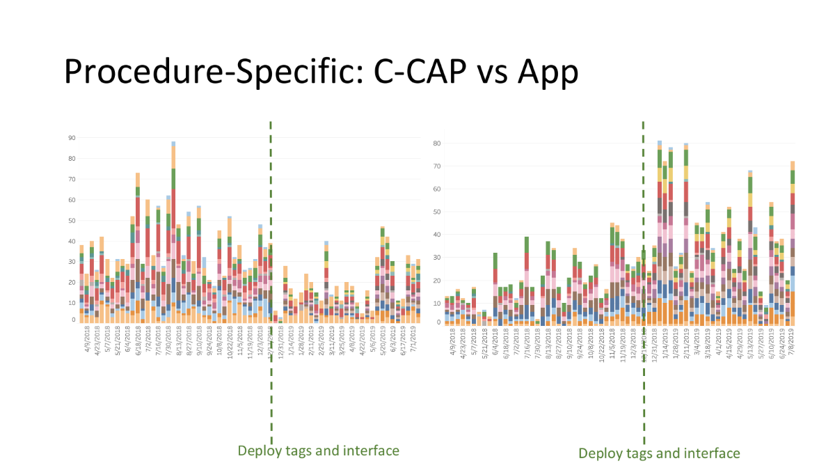
Contextualizing Further Data
While more tags were entered on the C-CAP vs online accounts, far more procedure-specific, rich tags were entered via surgeon account. Consistent with the findings of the initial usability tests, if anyone entered tags in the OR, it was the nurses, not the surgeons, who only knew the general context of the case.
11
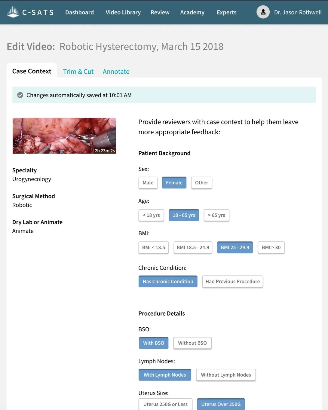
Current Iteration
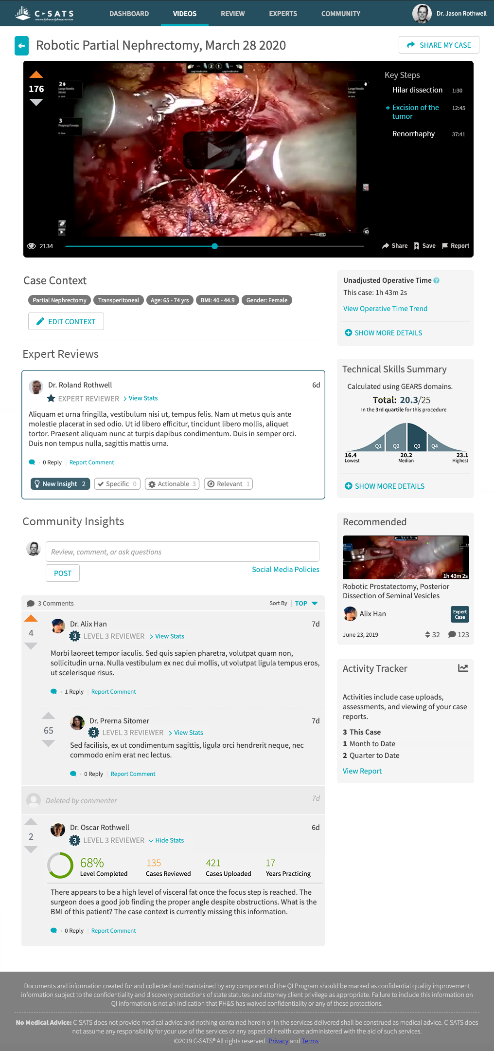
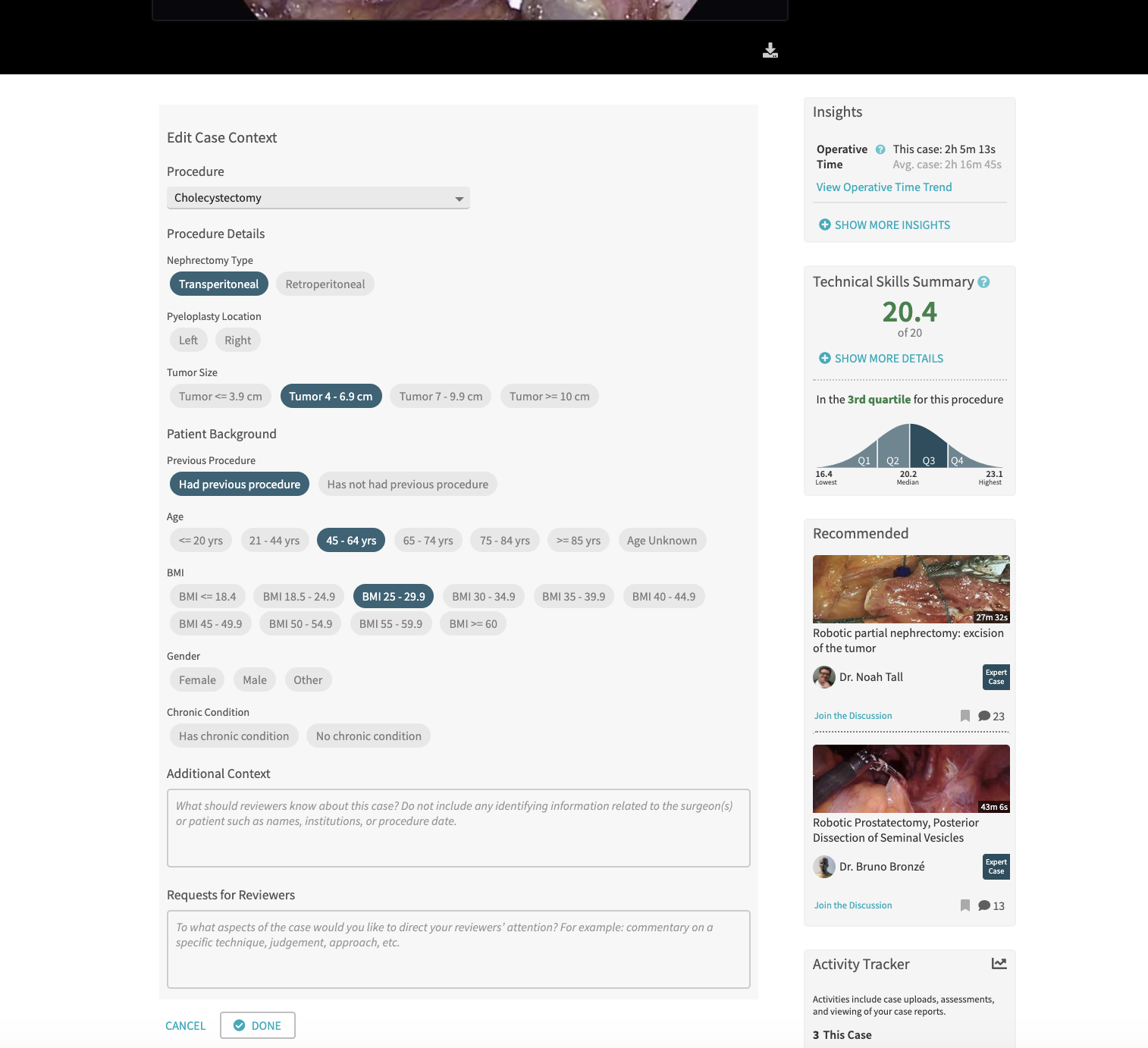
Expanded view of case context on the case report page, which also contains expert reviews, technical scoring, and case footage.
Removal from C-CAP
Based on the prior data, I recommended once again that case context, as a step that added friction to the C-CAP video upload process without a high value payoff, be removed from the C-CAP.
Page Consolidation
When there finally arose opportunity to update the outdated visual scheme and consolidate redundant pages, I recommended the placement of the context editing interface on the case report itself. Under the new design, surgeons would add context on an "empty" state of the case report. This was in collaboration with the UX lead, who took the opportunity for a sitewide visual styling refresh as well.
In addition to the free text area for context not covered by the toggle buttons, we also added a "Requests for Reviewers" text box for the performer(s) of the case to make requests for specific feedback.
12
The Outcomes

Exceeded Original Goal
As previously noted, this project exceeding the original goal: rather than 50% of incoming cases tagged 3 months after deploy, there were 66% of incoming cases tagged 1 month after deploy. In other words, the initial goal was exceeded by 16% within 1/3 of the time.

Other Usage Metrics
50% of overall C-SATS traffic is mobile, and this held true for case context entry as well, indicating both mobile and laptop usage from the surgeon’s lounge post-surgery.
Surgeons continue to add detailed case context for their case reviews to this day.
13
User Testimonials
“ It increases my confidence that the reviewer is giving clinically appropriate to my case.”
““It’s easier...it’s faster to click a button than type out a sentence...people might have different ways of saying the same thing, shorthand, abbreviations, etc, so it’s less area for it to be misinterpreted.””
“I like adding the case context.”